The blue color is nature’s rarest masterpiece, carrying a rich history in art and a profound psychological impact that can transform your paper floral designs into high-end interior statements.
The Cultural Prestige and Historical Weight of the Blue Color
When you choose to work with the blue color in your paper art, you are tapping into a legacy that was once reserved for royalty and the divine. For centuries, blue was one of the most expensive pigments to produce. In the history of art, “Ultramarine” was made from ground lapis lazuli, a semi-precious stone imported from Afghanistan. It was so costly that Renaissance painters often reserved it only for the most significant figures in their masterpieces. Understanding this historical prestige helps you realize why a single, well-crafted blue paper flower can instantly elevate the perceived value of an entire arrangement.
Throughout my 6 years of experience, I’ve observed that beginners often feel an instinctive attraction to blue but struggle to explain why. It is because blue is a “receding” color—it creates a sense of space and distance, much like the sky and the sea. In paper art, this translates to a sense of “quiet luxury.” While red or yellow grabs attention through high energy, blue invites the viewer to take a deep breath and linger. I once misunderstood this early in my career, thinking blue was too “cold” for home decor, but I eventually learned that its coolness is exactly what provides the modern, architectural crispness that clients crave in cardstock art.
Why We Find Blue Paper Flowers Irresistibly Captivating
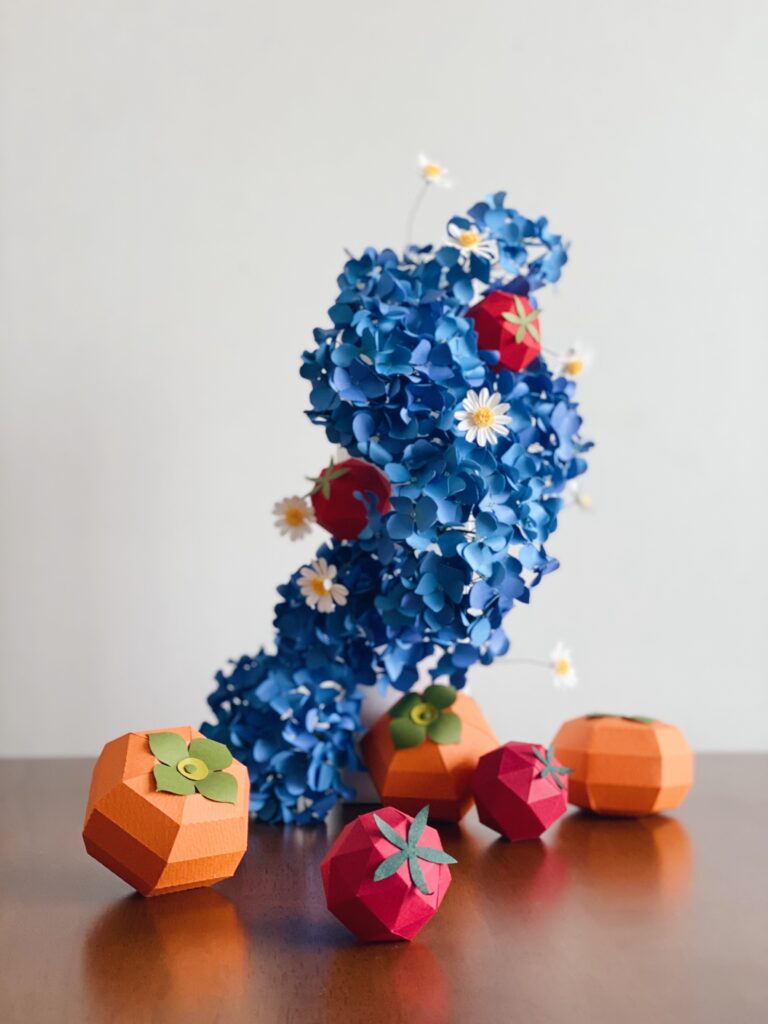
There is a specific psychological phenomenon when we see a blue paper flower. In nature, true blue is an anomaly. Most “blue” flowers in the garden, like hydrangeas or morning glories, are actually shades of purple or violet depending on the soil’s acidity. When you present a “True Navy” or “Electric Cobalt” flower made of cardstock, you are offering something that nature itself rarely produces. This creates a sense of wonder and exclusivity that crepe paper, with its softer and more organic texture, sometimes fails to capture as sharply.
I recall a pivotal moment in my career when I was commissioned to create a large-scale installation for an exhibition space. The project involved attaching iris-like blue flowers to deep, dark brown wooden branches, surrounded by a swarm of deep black paper butterflies. My goal was to evoke a scene from the movie Avatar—something otherworldly yet physically present. As I watched the sharp contrast between the black butterflies and the saturated blue color of the irises against the wood (as shown in the image below), I realized the true power of our medium. This is the “Game-Changer” moment: cardstock allows you to manifest the impossible colors of nature with a structural permanence that turns a dreamlike vision into a breathtaking reality.
The Struggle: Why Color Coordination with Blue Feels Difficult
Many beginners tell me, “I love blue, but whenever I mix it with other colors, the whole arrangement looks messy or muddy.” This is a structural challenge, not a lack of talent. The blue color has a very low “value” (it is dark) and a very specific temperature. Because blue is a primary color, it is very demanding; it doesn’t “bend” easily to fit other colors. If you pair it with a color that is too close in value, like a dark forest green, the details of your meticulous petal-work will simply disappear into a dark void.
One mistake I made for nearly two years was trying to use “natural” greens with deep blue flowers. I realized that standard leaf greens often contain too much yellow, which creates a jarring visual tension with the cool blue color. My approach changed when I started looking at the “undertones” of my cardstock. This is where many creators get confused: they see “blue,” but they don’t see the tiny bit of red (making it a warm blue) or the tiny bit of green (making it a cool blue) hidden inside.
Smart Strategies for Professional Blue Color Coordination
To coordinate the blue color like a pro, you must act like a stylist rather than just a maker. My favorite technique is the “High-Contrast Neutral” strategy. Instead of looking for another bright color to compete with the blue, look for a neutral that lets the blue breathe.
- The Slate Strategy: Pair deep navy with light gray or silver-toned leaves. This keeps the temperature “cool” and modern.
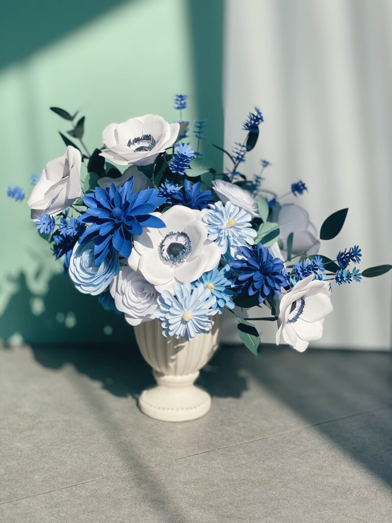
- The Analogous Gradient: Use three shades of blue cardstock (e.g., Sky Blue, Royal Blue, and Midnight Blue) in one flower. This adds depth without the risk of a “color clash.”
- The Complementary Pop: If you must use a warm color, choose a “muted” peach or a soft cream. Avoid bright orange; it’s too aggressive and can make your high-end cardstock look like a child’s craft project.
Practical Applications for Blue Paper Flower Items
Where do these blue color masterpieces belong in a home? Because blue promotes tranquility, they are the ultimate items for “restoration spaces.”
- Home Office Focus
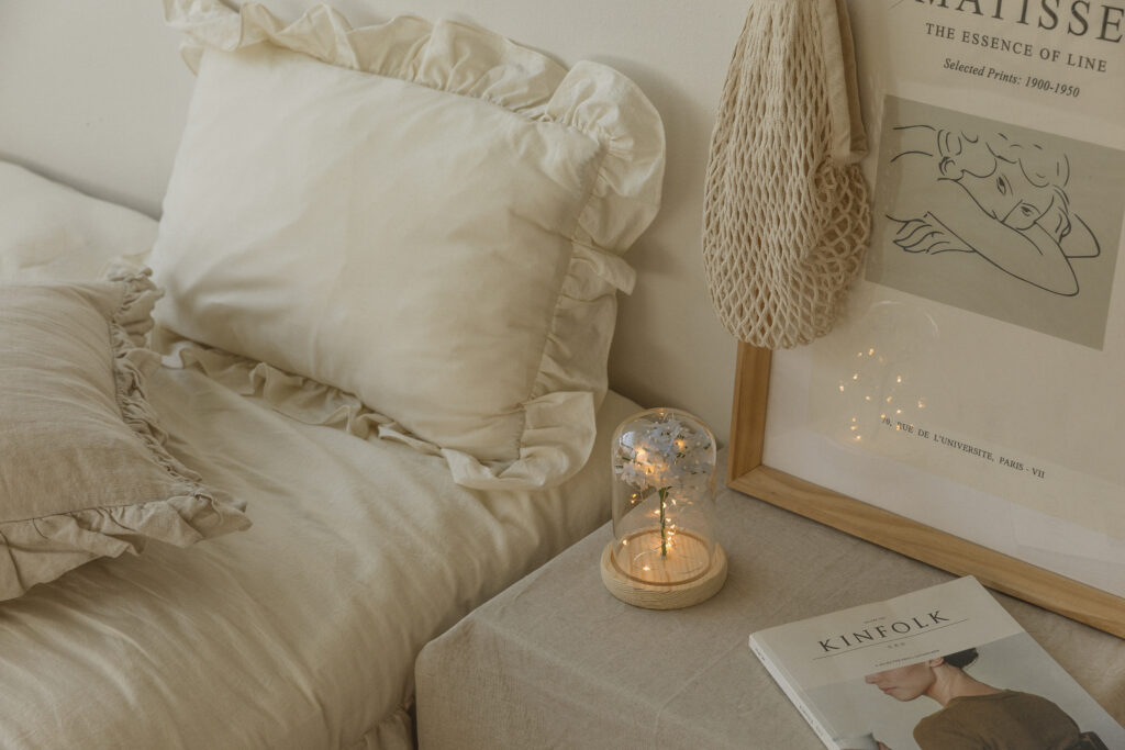
: A single, large-scale Navy Protea or Peony on a desk acts as a visual anchor. It helps reduce digital eye strain and provides a point of meditative focus. - Bedroom Serenity
: A small arrangement of periwinkle-blue cardstock hydrangeas on a bedside table creates a calming ritual before sleep. The matte texture of cardstock ensures there is no harsh reflection of light, maintaining a soft ambiance. - Branding and Events
: For high-end branding, blue paper flowers evoke “trust” and “reliability.” Use them in window displays or as permanent installations in boutique shops to create a sophisticated, high-authority brand image.
Comparison Table: Blue Color Material & Strategy
| Goal | Recommended Blue | Coordination Partner |
| Sophisticated Luxury | Midnight Navy | Silver / Cool Gray |
| Calm & Organic | Sky Blue | Sage Green / Cream |
| Bold & Artistic | Electric Cobalt | Deep Charcoal / White |
FAQ Section
Why does my blue cardstock flower look “flat” compared to a red one?
This is because the blue color absorbs more light. Red reflects more light, making shadows easier to see. To fix this, you must be more intentional with your scoring. I recommend using a bone folder to create deeper “veins” in blue petals. These structural shadows will compensate for the color’s natural light absorption.
Can I mix different brands of blue cardstock in one arrangement?
Yes, but be careful of the “undertone clash.” One brand’s navy might have a purple base, while another’s has a green base. I suggest testing them under the specific lighting where the flower will live. If they look “dirty” next to each other, the undertones are fighting.
Is blue cardstock more prone to showing glue marks?
Actually, yes. Darker blue colors show the “shiny” residue of hot glue very clearly. This is a common beginner frustration. My pro-tip: use a high-temperature glue gun for a thinner, cleaner bond, or use a tiny bit of blue soft pastel to dust over any accidental glue spots to mattify them.
Self-Check Section: Reflecting on Your Blue Art
Before you decide a project is a failure, take a moment to observe these points:
- Observe the Lighting: Is your flower looking purple? Check if you are using a warm yellow light bulb. Try moving it to natural daylight before changing the paper.
- Test the Contrast: Squint your eyes at the arrangement. Do the flowers and leaves blend into one dark shape? If so, you need a lighter neutral to create separation.
- Signs of Rushing: Are the edges of your blue petals frayed? Because dark blue highlights every imperfection, jagged edges are more noticeable. Ensure your blades are sharp.
Practical Wrap-Up: Your Next Step with Blue
Mastering the blue color in paper art is not about getting it “perfect” on the first try; it’s about adjusting your eyes to see the depth and undertones. Start small. Instead of a full bouquet, try making just one perfect, oversized navy rose using cardstock. Focus on the structural beauty and the way light interacts with the matte surface.
I encourage you to spend time observing the blue papers in different environments. See how they change from morning to night. Patience and observation are your best tools. Once you conquer the blue palette, every other color will feel much easier to manage. Let your creativity bloom in the deep, quiet spaces of blue.